9/6/24 4:00 PM

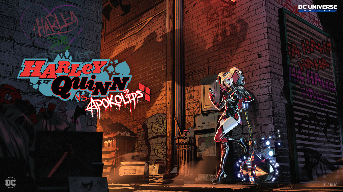
Have you been keeping up with our teasers on social media? If so, you must know that our upcoming Episode’s key art is chock full of easter eggs and surprises!
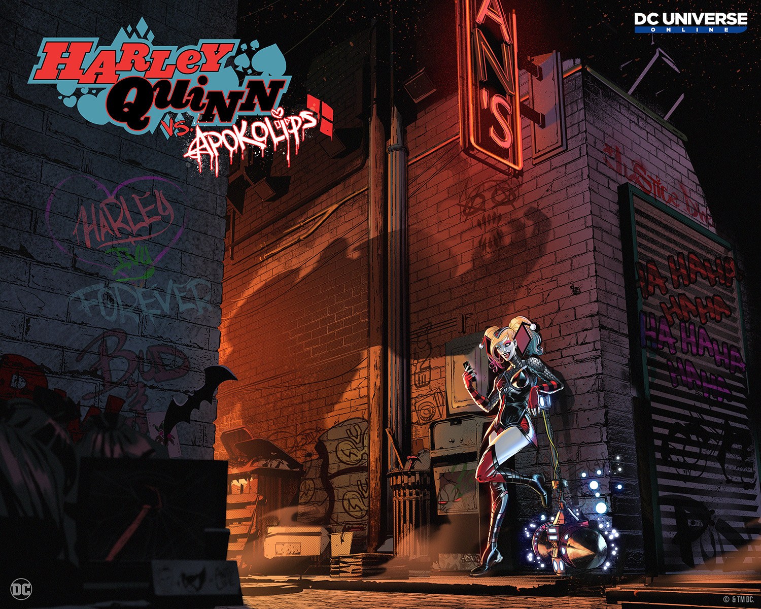
Today, we’re excited to share with everyone the FULL key art for the upcoming Episode, Harley Quinn vs. Apokolips!
Step into the world of Art Director Scot Boyd in an exclusive interview as he talks about the inspiration behind this magnificent piece, what the future of DCUO’s art direction looks like, what to be prepared for in this upcoming adventure with Harley Quinn, and so much more!

Click to see the full sized image!
Hello!
My name’s Scot Boyd, and I’m the Art Director for DC Universe Online. Today, I’m beyond excited to share the key art for our upcoming episode, Harley Quinn vs. Apokolips. It’s packed with a ton of Easter eggs and subtle – and not-so-subtle – nods to the three-issue comic run that inspired us. I’m fairly new to the team, and I also see this piece as a visual representation of the philosophy that’s driving me and our team of artists as we look to the future. Deep stuff, right? Let’s dive into it.
The open-world component of our Harley Quinn vs. Apokolips episode is set in South Gotham, which we haven’t visited since Flashpoint in 2021. It’s a particularly seedy section of the city, home to Penguin’s Iceberg Lounge. You may have visited here before, but things are a bit more, shall we say, apocalyptic this time around. Darkseid and his cronies tend to have that effect.
I’ll be honest, I like Taylor Swift, and I love the fact that when she introduces an album, she goes full on into Easter eggs. You can kind of suss out what the different themes are going to be, but she doesn’t say it outright. Or in Andor, when they go to the market, the guy's running his shop and there are all these Star Wars references everywhere. I love that kind of stuff, which is why I wanted to pack in as much as we could with this piece.
Harley is leaning against the wall in an alley, completely oblivious to what’s happening around her. In case you’re also completely oblivious, that big, overpowering shadow is being cast by the Subjukator. I'm a big fan of contrast, and I wanted to explore the idea that everything's dark and gray, but then there’s this blast of light that’s coming from a Boom Tube just outside of our view.
That’s not the only illumination that stands out in the key art. Just above the shadow’s hand, you can see the bottom part of a partially lit neon sign. You can’t read the whole thing, but it’s a sign for Noonan’s bar. It’s a notorious criminal hangout in South Gotham’s Cauldron neighborhood, which is probably why Harley doesn’t seem to have a care in the world. Or maybe she’s watching a very interesting cat video?
On the left side of the image, there’s a hard-to-miss Batarang sticking a Joker card to the wall, and some Poison Ivy graffiti. What’s this “Bud & ...” reference? If you moved some of the trash out of the way, you’d be able to see that the tag says “Bud & Lou,” a reference to Harley’s pet hyenas. So maybe she’s watching a very interesting dog video? It’s worth checking out some of the other tags, too. I won’t spoil too much, but it seems like someone has some less than kind opinions about some well-known characters and superhero groups.
Superfans will also find some very sneaky references to a few of the characters who will be joining us in Harley Quinn vs Apokolips. Be sure to zoom in so you don’t miss anything...
I can’t give too much away about the episode, but I’ll set the mood for you. This version of South Gotham feels like a very overcast, rainy evening in New York. So put yourself in the mindset of walking down Broadway in the middle of the street and it's raining. It’s absolutely pouring. It's wet everywhere. And, oh, by the way, there's giant alien structures running along the sides of the walls, and there's some lava beams up in the sky. That's the vibe you're getting here, and I'm really excited about it.
What I'm hoping for is when you get in this map and you look around, you're like, holy crap. This is different. This feels different. I’ve been working on game art for 27 years now, and this is my first time as the Art Director of DCUO getting a chance to help push that. I came in towards the end of Brainiac Returns!, and by then, things had already kind of been set established for that episode. But 48 allowed me to kind of start from scratch in terms of the decisions that we made to really make these maps feel better and to feel different.
Like the rain. Early on, I asked why don't we make it rain in South Gotham – and make it look really good? And we were able to spend a little bit more time getting better rain, and we found some cool things that were available to us that we just didn't know before. I asked the team ago is, have we ever used this kind of rain before? And they're like, not really. So the fans get to experience rain in our game in a new way! If you can change the overall mood of the map by throwing deep rain in there and then a bunch of lava and and all this apocalyptic architecture and stuff within it, yeah, that's going to change an existing map’s mood altogether.
I’m also pushing the team to step up our cinematics game. I think players are going to notice some improvements in terms of their framing and pacing in this episode. It’s an area that I’d like us to continue to keep improving upon as we continue to make DCUO the most faithful adaptation of this incredible creative playground possible. I want our game to look like a comic book come to life; we’re not interested in creating a photorealistic game. If you think this key art looks like a comic-book cover, that’s about the best praise you could give us.
We’re excited to share more, but I’m going to have to put a pin on this for the time being. Thanks for reading – and I can’t wait to hear what you think about Harley Quinn vs Apokolips. Bye for now!
Scot Boyd
Art Director
Stay in the loop by joining us on X, Facebook, Instagram, and Discord.